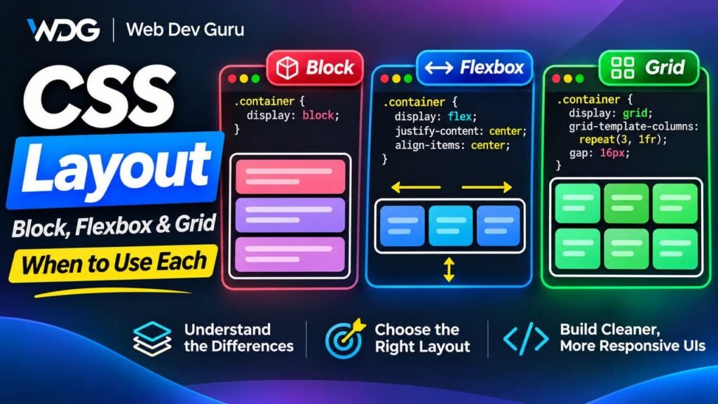
Introduction
CSS layout can feel confusing at first because there are several different ways to arrange elements on a page.
You can let elements follow the browser’s normal document flow.
You can use Flexbox.
You can use Grid.
You can also combine all three approaches on the same page.
The difficult part is usually not learning the syntax.
It is understanding which layout system is the right tool for a particular problem.
That is what this article focuses on.
We will look at:
- normal document flow
- block and inline behavior
- Flexbox
- CSS Grid
- how they differ
- when to use each one
- how they work together in real projects
The goal is not to memorize properties.
The goal is to develop a practical mental model for choosing the right layout system.
1. CSS Layout Starts With Normal Flow
Before using Flexbox or Grid, the browser already knows how to lay out HTML.
This default behavior is called normal flow.
Consider this HTML:
<h1>CSS Layout</h1>

<p>
    This paragraph appears below the heading.
</p>

<p>
    This paragraph appears below the previous paragraph.
</p>
Without any CSS, the browser still creates a readable layout.
The heading appears first.
The first paragraph appears below it.
The second paragraph appears below the first.
That is normal flow.
A simplified representation looks like this:
Heading
↓
Paragraph
↓
Paragraph
This default behavior is extremely important.
Many layouts do not need Flexbox or Grid at all.
2. Block Elements Stack Vertically
Many HTML elements are block-level elements by default.
Examples include:
<div>
<p>
<h1>
<h2>
<section>
<article>
<header>
<footer>
A block element usually takes the available horizontal space and starts on a new line.
For example:
<div class="box">First box</div>
<div class="box">Second box</div>
<div class="box">Third box</div>
With simple CSS:
.box {
    padding: 20px;
    border: 1px solid #ccc;
}
the elements naturally stack vertically:
First box
──────────
Second box
──────────
Third box
No Flexbox is required.
No Grid is required.
The browser’s normal flow already produces the correct result.
3. Inline Elements Behave Differently
Inline elements normally stay within the flow of text.
Examples include:
<span>
<a>
<strong>
<em>
For example:
<p>
    Learn <strong>HTML</strong>,
    <strong>CSS</strong> and
    <strong>JavaScript</strong>.
</p>
The <strong> elements do not start new lines.
They remain inside the paragraph.
This distinction between block and inline behavior is part of the browser’s default layout model.
4. Why Normal Flow Is More Powerful Than It Looks
Developers sometimes reach for Flexbox or Grid too quickly.
But normal flow is often the best layout system for content-heavy pages.
Consider an article:
<article>

    <h1>Understanding CSS Layout</h1>

    <p>
        CSS provides several ways to position content.
    </p>

    <h2>Normal Flow</h2>

    <p>
        Normal flow is the browser's default layout behavior.
    </p>

    <h2>Flexbox</h2>

    <p>
        Flexbox is useful for one-dimensional layouts.
    </p>

</article>
This content should naturally flow from top to bottom.
Adding Flexbox here would not improve anything.
In fact, it could make the structure unnecessarily complicated.
A useful principle is:
If the browser’s normal flow already gives you the layout you need, do not replace it.
5. A Common Mistake: Making Everything Flex
You may see code like this:
body {
    display: flex;
    flex-direction: column;
}
Sometimes that is useful.
But if the goal is only to make page sections appear one below another, it is unnecessary.
The browser already does that.
For example:
<header>...</header>
<main>...</main>
<footer>...</footer>
naturally becomes:
Header
Main
Footer
because those elements participate in normal block flow.
Use Flexbox because you need Flexbox behavior, not simply because it exists.
6. When Normal Flow Is the Right Choice
Normal flow is usually ideal for:
- articles
- blog posts
- documentation
- text-heavy pages
- stacked page sections
- headings and paragraphs
- forms arranged vertically
- long content that should expand naturally
For example:
<form>

    <label for="name">Name</label>
    <input id="name" type="text">

    <label for="email">Email</label>
    <input id="email" type="email">

    <button type="submit">
        Send
    </button>

</form>
With:
label,
input,
button {
    display: block;
}
the form can flow vertically without a special layout system.
7. So Why Do We Need Flexbox?
Normal flow is excellent when elements should stack naturally.
But sometimes we need elements to align along the same axis.
For example:
Logo Navigation Buttonor:
[Icon] Textor:
Card Card CardFlexbox was designed for these kinds of problems.
Flexbox is a one-dimensional layout system.
That means it primarily works along one main axis at a time.
The axis can be horizontal or vertical.
8. Creating a Flex Container
Consider this HTML:
<div class="toolbar">
    <button>Back</button>
    <button>Save</button>
    <button>Publish</button>
</div>
By default, buttons may appear inline, but we have limited control over their spacing and alignment.
We can turn the parent into a flex container:
.toolbar {
    display: flex;
}
Now the direct children become flex items.
The default main axis is horizontal:
Back Save PublishThis is the basic idea behind Flexbox.
9. Flexbox Has a Main Axis and a Cross Axis
Flexbox becomes much easier when you understand its two axes.
With:
.container {
    display: flex;
    flex-direction: row;
}
the main axis runs horizontally:
Main axis →
Item  Item  Item
The cross axis runs vertically.
If we change the direction:
.container {
    display: flex;
    flex-direction: column;
}
the main axis becomes vertical:
Main axis
↓
Item
Item
Item
This explains why Flexbox properties behave differently depending on flex-direction.
10. justify-content Controls the Main Axis
Suppose we have:
<nav class="navigation">
    <a href="/">Home</a>
    <a href="/articles">Articles</a>
    <a href="/contact">Contact</a>
</nav>
We can write:
.navigation {
    display: flex;
    justify-content: center;
    gap: 24px;
}
Because the default direction is row, the main axis is horizontal.
So:
justify-content: center;centers the links horizontally.
Other common values include:
justify-content: flex-start;
justify-content: flex-end;
justify-content: space-between;
justify-content: space-around;
justify-content: space-evenly;
11. align-items Controls the Cross Axis
Consider a header:
<header class="site-header">

    <a href="/" class="logo">
        Web Dev Guru
    </a>

    <nav>
        ...
    </nav>

    <button>
        Subscribe
    </button>

</header>
We might use:
.site-header {
    display: flex;
    align-items: center;
    gap: 32px;
}
Because the main axis is horizontal, the cross axis is vertical.
Therefore:
align-items: center;vertically centers the items relative to each other.
This is one of the most common Flexbox patterns.
12. gap Is Better Than Manual Margins for Many Layouts
Older layouts often used margins between flex items:
.navigation a {
    margin-right: 24px;
}
But then the last item may need special treatment.
Flexbox supports:
.navigation {
    display: flex;
    gap: 24px;
}
Now spacing belongs to the container rather than to each individual item.
This usually makes the layout cleaner and easier to maintain.
13. A Common Header Pattern
Flexbox is excellent for headers because headers usually arrange content along one primary horizontal axis.
For example:
<header class="site-header">

    <a href="/" class="logo">
        Web Dev Guru
    </a>

    <nav class="primary-nav">
        <a href="/tutorials">Tutorials</a>
        <a href="/articles">Articles</a>
        <a href="/snippets">Snippets</a>
    </nav>

    <a href="/start-here" class="button">
        Start Here
    </a>

</header>
CSS:
.site-header {
    display: flex;
    align-items: center;
    gap: 32px;
}
Now we can push the navigation away from the logo:
.primary-nav {
    margin-left: auto;
}
The result becomes:
Logo Navigation Start HereThis is a classic Flexbox problem.
14. Flexbox Is Excellent for Component-Level Layout
Flexbox is often ideal inside small components.
For example:
<div class="author">

    <img
        src="author.jpg"
        alt=""
        class="author-image"
    >

    <div>
        <strong>Alex Developer</strong>
        <p>Frontend Developer</p>
    </div>

</div>
CSS:
.author {
    display: flex;
    align-items: center;
    gap: 16px;
}
The image and text are arranged along one row.
This is a one-dimensional relationship.
Flexbox fits naturally.
15. What Does “One-Dimensional” Really Mean?
When we say Flexbox is one-dimensional, we do not mean it can only create one row.
Flex items can wrap.
For example:
.cards {
    display: flex;
    flex-wrap: wrap;
    gap: 24px;
}
You can get:
Card  Card  Card
Card  Card
But Flexbox still primarily distributes items along one axis.
Each row behaves somewhat independently.
That matters when you want strict alignment across both rows and columns.
That is where Grid becomes more powerful.
16. When Flexbox Starts Feeling Awkward
Imagine a card layout:
Card  Card  Card
Card  Card  Card
You want:
- equal columns
- consistent column gaps
- consistent row gaps
- strong alignment in both directions
You can build this with Flexbox.
For example:
.cards {
    display: flex;
    flex-wrap: wrap;
    gap: 24px;
}

.card {
    width: calc(33.333% - 16px);
}
This works, but the width calculation is already becoming awkward.
The layout is really two-dimensional.
We care about both:
columns ↔
rows    ↕
That is the kind of problem CSS Grid was designed to solve.
17. CSS Grid Is a Two-Dimensional Layout System
Grid lets you define rows and columns together.
Consider:
<div class="card-grid">

    <article class="card">Card 1</article>
    <article class="card">Card 2</article>
    <article class="card">Card 3</article>
    <article class="card">Card 4</article>
    <article class="card">Card 5</article>
    <article class="card">Card 6</article>

</div>
CSS:
.card-grid {
    display: grid;
    grid-template-columns: repeat(3, 1fr);
    gap: 24px;
}
This creates three equal columns.
The browser automatically creates new rows as needed.
The result:
Card 1   Card 2   Card 3
Card 4   Card 5   Card 6
No percentage calculations are required.
18. Understanding fr
The fr unit represents a fraction of the available space.
For example:
grid-template-columns: 1fr 1fr 1fr;creates three equal columns.
This is equivalent to:
grid-template-columns: repeat(3, 1fr);If we write:
grid-template-columns: 2fr 1fr;the first column receives twice as much free space as the second.
Conceptually:
|--------- 2fr ---------|---- 1fr ----|This is extremely useful for page layouts.
19. A Main Content and Sidebar Layout
Suppose we want:
Main Content Sidebarwhere the main content should be wider.
We can use:
<div class="content-layout">

    <main>
        ...
    </main>

    <aside>
        ...
    </aside>

</div>
CSS:
.content-layout {
    display: grid;
    grid-template-columns: 2fr 1fr;
    gap: 32px;
}
Now Grid explicitly defines two columns.
This is usually clearer than manually controlling widths with Flexbox.
20. Grid Lets You Define Exact Relationships
You are not limited to fractions.
For example:
.content-layout {
    display: grid;
    grid-template-columns: minmax(0, 780px) 320px;
    gap: 32px;
}
Now the content column can grow up to 780px while the sidebar stays at 320px.
Or:
.content-layout {
    display: grid;
    grid-template-columns: 240px 1fr;
    gap: 32px;
}
This is useful for:
Navigation / TOC Main contentGrid makes the relationship between columns explicit.
21. Responsive Grid Without Many Media Queries
One of the most useful Grid patterns is:
.card-grid {
    display: grid;
    grid-template-columns: repeat(
        auto-fit,
        minmax(250px, 1fr)
    );
    gap: 24px;
}
This tells the browser:
- create as many columns as fit
- each column should be at least 250px wide
- otherwise let columns share available space
The layout can automatically change from:
Card Card Card Cardto:
Card Card
Card Cardand then:
Card
Card
Card
Carddepending on available width.
This can reduce the number of media queries you need.
22. Grid Is Excellent for Page-Level Structure
Grid is often especially useful for larger layout relationships.
For example:
<div class="page-layout">

    <header>Header</header>

    <aside>Sidebar</aside>

    <main>Main content</main>

    <footer>Footer</footer>

</div>
You could write:
.page-layout {
    display: grid;

    grid-template-columns: 240px 1fr;

    grid-template-areas:
        "header header"
        "sidebar main"
        "footer footer";
}
Then assign areas:
header {
    grid-area: header;
}

aside {
    grid-area: sidebar;
}

main {
    grid-area: main;
}

footer {
    grid-area: footer;
}
This makes the page structure visible directly in the CSS.
23. Grid Is Not Always Better Than Flexbox
Because Grid is powerful, it can be tempting to use it everywhere.
But consider this simple button group:
<div class="actions">
    <button>Cancel</button>
    <button>Save</button>
</div>
You could use Grid:
.actions {
    display: grid;
    grid-template-columns: auto auto;
}
But Flexbox is simpler:
.actions {
    display: flex;
    gap: 12px;
}
The layout has one primary axis.
Flexbox communicates that intention better.
A useful principle is:
Use the simplest layout system that naturally matches the problem.
24. Flexbox vs Grid: The Core Difference
A simple way to think about them is:
Flexbox → one-dimensional relationships
Grid    → two-dimensional relationships
Flexbox asks:
How should these items be distributed along this row or column?
Grid asks:
How should these items fit into rows and columns?
This is not an absolute rule, but it is an excellent starting point.
25. Example: Navigation
Navigation usually looks like:
Home Tutorials Articles SnippetsThere is one clear horizontal axis.
Use Flexbox:
.navigation {
    display: flex;
    gap: 24px;
}
Grid would work, but it would usually be unnecessary.
26. Example: Card Grid
A card archive might look like:
Card  Card  Card
Card  Card  Card
Rows and columns both matter.
Use Grid:
.card-grid {
    display: grid;
    grid-template-columns: repeat(3, 1fr);
    gap: 24px;
}
This expresses the layout more directly.
27. Example: Vertical Article Content
An article looks like:
Heading

Paragraph

Heading

Paragraph

Code block

Paragraph
Use normal flow.
You probably do not need:
article {
    display: flex;
    flex-direction: column;
}
The browser already stacks block content vertically.
28. Real Websites Usually Combine All Three
A professional page might use all three layout systems.
For example:
<header class="site-header">
    ...
</header>

<main class="page">

    <section class="hero">
        ...
    </section>

    <section class="featured">

        <div class="card-grid">
            ...
        </div>

    </section>

</main>
The overall page sections can use normal flow.
The header can use Flexbox:
.site-header {
    display: flex;
    align-items: center;
    justify-content: space-between;
}
The card section can use Grid:
.card-grid {
    display: grid;
    grid-template-columns: repeat(3, 1fr);
    gap: 24px;
}
There is no reason to choose only one layout system for the whole website.
29. A Useful Layout Strategy
A practical approach is:
Step 1: Start With Normal Flow
Write clean HTML and let the browser stack content naturally.
For example:
<section>
    <h2>Latest Articles</h2>
    <p>Browse our newest content.</p>
</section>
Do not introduce a layout system until you actually need one.
Step 2: Use Flexbox for Alignment Along One Axis
For example:
.section-header {
    display: flex;
    justify-content: space-between;
    align-items: center;
}
Step 3: Use Grid When Rows and Columns Matter Together
For example:
.cards {
    display: grid;
    grid-template-columns: repeat(3, 1fr);
    gap: 24px;
}
This keeps your CSS simpler.
30. Flexbox Can Still Be Used Inside Grid
Grid and Flexbox are not competitors.
They work very well together.
Consider a card grid:
<div class="card-grid">

    <article class="card">

        <img src="article.jpg" alt="">

        <div class="card-content">

            <h2>CSS Layout Explained</h2>

            <p>
                Learn when to use normal flow, Flexbox and Grid.
            </p>

            <a href="#">
                Read Article
            </a>

        </div>

    </article>

</div>
The outer layout can use Grid:
.card-grid {
    display: grid;
    grid-template-columns: repeat(3, 1fr);
    gap: 24px;
}
Inside each card, Flexbox may help arrange content vertically:
.card-content {
    display: flex;
    flex-direction: column;
    gap: 16px;
}
We can even push the link to the bottom:
.card-content a {
    margin-top: auto;
}
Grid controls the relationship between cards.
Flexbox controls the internal card layout.
That is a very common real-world pattern.
31. Flexbox Wrapping vs Grid Columns
Consider this Flexbox layout:
.cards {
    display: flex;
    flex-wrap: wrap;
    gap: 24px;
}

.card {
    flex: 1 1 250px;
}
This is useful when you want flexible items that wrap naturally.
But each row can distribute its remaining space independently.
That means the last row may look different.
Grid:
.cards {
    display: grid;
    grid-template-columns: repeat(
        auto-fit,
        minmax(250px, 1fr)
    );
    gap: 24px;
}
creates a stronger column structure.
Which one is better depends on the design.
If you care about items flowing naturally, Flexbox may be ideal.
If you care about consistent columns, Grid is often better.
32. The Difference Between Content-Driven and Layout-Driven Design
Another useful way to think about the choice is:
Flexbox is often content-driven
The items influence how space is distributed.
For example:
.navigation {
    display: flex;
    gap: 20px;
}
Each navigation link can be only as wide as its content.
Grid is often layout-driven
You define the tracks first.
For example:
.cards {
    display: grid;
    grid-template-columns: repeat(3, 1fr);
}
The layout establishes three columns, and items occupy those columns.
This distinction is not absolute, but it can help you choose.
33. Responsive Design With Flexbox
Flexbox can respond well to smaller screens.
For example:
.site-header {
    display: flex;
    align-items: center;
    gap: 24px;
}
At smaller widths:
@media (max-width: 768px) {
    .site-header {
        flex-direction: column;
        align-items: stretch;
    }
}
Now the horizontal header becomes vertical.
Desktop:
Logo Navigation ButtonMobile:
Logo
Navigation
ButtonThis is a natural Flexbox transformation.
34. Responsive Design With Grid
Grid can also change structure at breakpoints.
For example:
.content-layout {
    display: grid;
    grid-template-columns: 1fr 320px;
    gap: 32px;
}
On smaller screens:
@media (max-width: 900px) {
    .content-layout {
        grid-template-columns: 1fr;
    }
}
Desktop:
Main Content SidebarMobile:
Main Content
SidebarGrid makes this transition straightforward.
35. Avoid Fixed Width Thinking
When learning layout, beginners often use fixed widths everywhere:
.card {
    width: 300px;
}
That may work at one screen size.
But responsive layout usually benefits from flexible sizing.
With Flexbox:
.card {
    flex: 1 1 280px;
}
With Grid:
.card-grid {
    grid-template-columns: repeat(
        auto-fit,
        minmax(280px, 1fr)
    );
}
The browser can then adapt to available space.
Modern CSS works best when you allow the browser to participate in layout decisions.
36. minmax() Makes Grid Extremely Flexible
Consider:
grid-template-columns: repeat(
    auto-fit,
    minmax(240px, 1fr)
);
minmax() defines a minimum and maximum track size.
Here:
minimum = 240px
maximum = 1fr
So a column should not shrink below 240px.
If there is more space available, it can grow.
This creates responsive behavior without hardcoding every screen size.
37. auto-fit and auto-fill
You may encounter both:
auto-fitand:
auto-fillBoth can create as many grid tracks as fit.
A common responsive card pattern is:
.card-grid {
    display: grid;
    grid-template-columns: repeat(
        auto-fit,
        minmax(250px, 1fr)
    );
}
auto-fit often works well when you want existing items to expand and fill available space.
The exact distinction becomes more important in advanced layouts, but beginners can use auto-fit effectively for many responsive card grids.
38. Normal Flow Still Exists Inside Flexbox and Grid
An important point is that layout systems are nested.
Suppose we have:
<div class="card-grid">

    <article class="card">
        <h2>Title</h2>
        <p>Description</p>
        <p>More text</p>
    </article>

</div>
The .card-grid might use Grid:
.card-grid {
    display: grid;
    grid-template-columns: repeat(3, 1fr);
}
But inside each .card, the heading and paragraphs still participate in normal flow unless you change them.
So the page is not using one layout system.
It is using several layout contexts at different levels.
39. Avoid Using Positioning for Normal Layout
Another common beginner mistake is trying to build layouts with:
position: absolute;For example:
.card {
    position: absolute;
    left: 300px;
    top: 200px;
}
Absolute positioning removes an element from normal flow.
That can be useful for overlays, badges, icons, and special effects.
But it is usually a poor choice for general page layout.
For normal content relationships, prefer:
- normal flow
- Flexbox
- Grid
These systems are designed to adapt to changing content and viewport sizes.
40. Example: A Badge Is a Good Positioning Use Case
Suppose a card contains a badge:
<article class="card">

    <span class="badge">
        New
    </span>

    <h2>CSS Grid Guide</h2>

</article>
CSS:
.card {
    position: relative;
}

.badge {
    position: absolute;
    top: 12px;
    right: 12px;
}
This is appropriate because the badge is positioned relative to the card.
But the main card layout should still rely on normal flow, Flexbox, or Grid.
41. A Complete Real-World Example
Imagine a tutorial archive page.
HTML:
<main>

    <header class="archive-header">

        <div>
            <h1>Tutorials</h1>

            <p>
                Learn web development by building real projects.
            </p>
        </div>

        <a href="/start-here" class="button">
            Start Here
        </a>

    </header>

    <div class="tutorial-grid">

        <article class="tutorial-card">

            <img
                src="tutorial-1.jpg"
                alt=""
            >

            <div class="tutorial-card-content">

                <h2>
                    Build a Responsive Navigation
                </h2>

                <p>
                    Learn HTML, CSS and JavaScript step by step.
                </p>

                <a href="#">
                    View Tutorial
                </a>

            </div>

        </article>

    </div>

</main>
The main page content can remain in normal flow.
The archive header uses Flexbox:
.archive-header {
    display: flex;
    justify-content: space-between;
    align-items: center;
    gap: 32px;
}
The card list uses Grid:
.tutorial-grid {
    display: grid;

    grid-template-columns: repeat(
        auto-fit,
        minmax(280px, 1fr)
    );

    gap: 32px;
}
Each card can use Flexbox internally:
.tutorial-card-content {
    display: flex;
    flex-direction: column;
    gap: 16px;
}
The page uses all three ideas:
Normal Flow
    ↓
Page sections

Flexbox
    ↓
Archive header
    ↓
Card internal layout

Grid
    ↓
Card collection
This is how modern CSS layout is typically used in real projects.
42. How to Decide Which Layout System to Use
When building a layout, ask these questions.
Question 1: Does the content already work in normal flow?
If yes, keep it.
Example:
Heading
Paragraph
Heading
Paragraph
Use normal flow.
Question 2: Do I mainly need alignment along one axis?
Example:
Logo Navigation ButtonUse Flexbox.
Question 3: Do rows and columns both matter?
Example:
Card  Card  Card
Card  Card  Card
Use Grid.
Question 4: Am I trying to force the layout with absolute positioning?
If yes, ask whether Flexbox or Grid would better describe the relationship.
43. A Quick Comparison
| Layout system | Best for | Main strength |
|---|---|---|
| Normal flow | Documents and stacked content | Natural content flow |
| Flexbox | One-dimensional layouts | Alignment and distribution |
| Grid | Two-dimensional layouts | Rows and columns together |
Another way to remember it:
Normal Flow → Let content flow
Flexbox     → Align items
Grid        → Define structure
44. Common Mistakes
Using Flexbox when normal flow is enough
Avoid:
article {
    display: flex;
    flex-direction: column;
}
unless you actually need Flexbox behavior.
Using Grid for a simple row of buttons
Avoid unnecessary complexity.
This:
.actions {
    display: flex;
    gap: 12px;
}
is often clearer.
Using percentage calculations for card columns
Instead of:
.card {
    width: calc(33.333% - 20px);
}
Grid may be cleaner:
.cards {
    display: grid;
    grid-template-columns: repeat(3, 1fr);
    gap: 30px;
}
Using absolute positioning for page structure
Avoid positioning major layout sections manually.
Use layout systems that respond naturally to content and screen size.
45. Do Not Choose Based on Habit
A developer may become comfortable with Flexbox and start using it everywhere.
Another developer may prefer Grid and try to solve every layout with Grid.
Both approaches can create unnecessary complexity.
Instead, choose based on the relationship between the elements.
Ask:
What is the layout trying to express?If it is natural content flow, use normal flow.
If it is alignment along one axis, use Flexbox.
If it is a two-dimensional structure, use Grid.
46. The Browser Is Already a Layout Engine
One of the most important lessons in modern CSS is that you do not need to manually control every pixel.
The browser already understands:
- available space
- content size
- intrinsic dimensions
- flexible tracks
- wrapping
- minimum sizes
- maximum sizes
For example:
grid-template-columns: repeat(
    auto-fit,
    minmax(260px, 1fr)
);
lets the browser decide how many columns fit.
That is often better than writing many hardcoded breakpoints.
Good modern CSS gives the browser rules rather than micromanaging every position.
47. A Practical Mental Model
You can remember CSS layout with three layers.
Normal Flow
Use it when content should naturally follow the document.
Section
↓
Section
↓
Section
Flexbox
Use it when items need to align and distribute along one primary axis.
Item → Item → Itemor:
Item
↓
Item
↓
Item
Grid
Use it when the layout has meaningful rows and columns.
Item  Item  Item
Item  Item  Item
Then combine them where appropriate.
Final Example
Imagine a page with:
Header

Hero

Featured Articles

Newsletter

Footer
The page sections themselves can use normal flow.
Inside the header:
Logo Navigation Buttonuse Flexbox.
Inside Featured Articles:
Card  Card  Card
Card  Card  Card
use Grid.
Inside each card:
Image

Title

Description

Button
normal flow may be enough.
Or Flexbox can help if you need the button aligned to the bottom.
This is the real power of CSS layout:
you do not choose one system.
You choose the best system for each relationship.
Conclusion
Normal flow, Flexbox, and Grid are not competing technologies.
They solve different layout problems.
Normal flow is the foundation.
It is ideal for documents, articles, stacked sections, and content that should expand naturally.
Flexbox is best when elements need to align or distribute along one primary axis.
It is excellent for navigation, headers, toolbars, button groups, and component-level alignment.
Grid is best when rows and columns matter together.
It is ideal for card layouts, page structures, galleries, sidebars, dashboards, and other two-dimensional relationships.
The most important skill is not memorizing every CSS property.
It is recognizing the shape of the layout problem.
A strong default strategy is:
Start with normal flow.

Use Flexbox when you need one-dimensional alignment.

Use Grid when you need two-dimensional structure.
When you choose the layout system based on the content relationship rather than habit, your CSS becomes simpler, more responsive, and much easier to maintain.