How to Create an Interactive 3D Panorama with HTML, CSS and JavaScript
Build an interactive fullscreen 3D panorama using HTML, CSS perspective, glowing spheres, animated gradients, and JavaScript mouse tracking. Follow ten practical steps and copy the complete working example.
Introduction
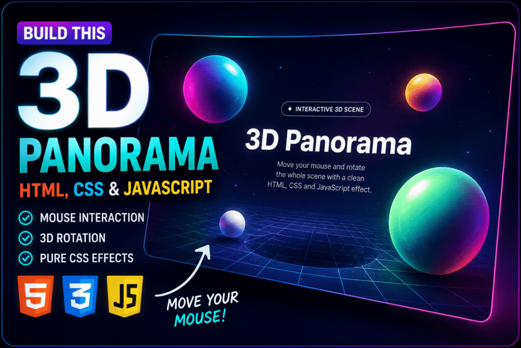
Create a cinematic, interactive 3D panorama with only HTML, CSS, and a little JavaScript. In this step-by-step video tutorial, you will build a fullscreen gradient background, a perspective grid, four glowing floating spheres, and a central title. Moving your mouse tilts the scene; leaving the window returns it to its original angle.
This project uses native web technologies—no JavaScript framework, Canvas, WebGL library, or external image assets.
What You Will Build
By the end, your page will include:
- A fullscreen
.stagethat holds the experience. - A
.scenewith a tilted CSS grid and four shiny gradient spheres. - Independent floating animations and depth using
translateZ(). - A centered headline and descriptive text above the scene.
- Mouse-controlled rotation and a smooth reset on mouse leave.
- A small responsive adjustment for narrower screens.
The visual result is an illusion of 3D depth built with CSS. It is not a photorealistic panorama or an actual 360° photo viewer.
Before You Start
Create a folder named interactive-3d-panorama and add an index.html file. We will place the HTML structure in <body>, CSS in a <style> element inside <head>, and JavaScript in a <script> element just before </body>.
Start with this document shell:
<!doctype html>
<html lang="en">
<head>
  <meta charset="utf-8" />
  <meta name="viewport" content="width=device-width,initial-scale=1" />
  <title>Interactive 3D Panorama Tutorial</title>
  <style>
  </style>
</head>
<body>

  <script>
  </script>
</body>
</html>
How to follow along: Add each CSS snippet inside the same existing <style> element, in the order shown. Add the final mouse interaction and reset handlers inside the same <script> element. Do not paste multiple full <html> documents or redundant <script> elements into the page.
Step 1: Create the Basic HTML Layout
Begin with one fullscreen wrapper: <main class="stage" id="stage">. Inside it, make the decorative .scene and a separate .hero-text section. The scene contains a grid and four spheres. The text remains readable above those visual elements.
Place this markup inside <body>, before the <script> element:
<main class="stage" id="stage">
  <div class="scene" id="scene" aria-hidden="true">
    <div class="grid"></div>
    <div class="sphere one"></div>
    <div class="sphere two"></div>
    <div class="sphere three"></div>
    <div class="sphere four"></div>
  </div>

  <section class="hero-text">
    <div class="label">✦ Interactive CSS Scene</div>
    <h1>3D Panorama</h1>
    <p>Move your mouse and rotate the whole scene with a clean HTML, CSS and JavaScript effect.</p>
  </section>
</main>
The .stage is the main container. The .scene will receive a 3D transform and holds the purely decorative shapes, which is why it uses aria-hidden="true". The .hero-text section contains the visible heading and description. All shapes are simple <div> elements for now.
Checkpoint: The page is still unstyled, but the structure is present. There is one main heading and one scene container.
Step 2: Add Global CSS and a Fullscreen Background
Define your palette using custom properties on :root, set a consistent box model with box-sizing: border-box, and remove the browser’s default body margin. The body background combines three translucent radial gradients with a dark linear gradient to create a futuristic glow.
Add the following to the existing <style> element (do not add another <style> tag):
:root{
      --bg0: #050816;
      --bg1: #111a3a;
      --text: #f4f7ff;
      --muted: rgba(244,247,255,.68);
      --accent: #7df9ff;
      --accent2: #ff7ad9;
      --accent3: #ffd36e;
    }

    *{
      box-sizing: border-box;
    }

    html,
    body{
      width: 100%;
      height: 100%;
    }
body{
  margin: 0;
  overflow: hidden;
  font-family: system-ui, -apple-system, BlinkMacSystemFont, "Segoe UI", sans-serif;
  color: var(--text);
  background:
    radial-gradient(circle at 20% 15%, rgba(125,249,255,.18), transparent 32%),
    radial-gradient(circle at 80% 20%, rgba(255,122,217,.16), transparent 34%),
    radial-gradient(circle at 50% 90%, rgba(255,211,110,.12), transparent 38%),
    linear-gradient(135deg, var(--bg0), var(--bg1));
}--accent, --accent2, and --accent3 control the sphere colors. The radial gradients create colored light around the corners, while the final linear gradient provides the dark base. The source example uses overflow: hidden for a fullscreen effect, which is suitable for this isolated demo but needs reconsideration if you embed the scene in a scrolling website.
Checkpoint: The whole browser viewport now has a dark, softly glowing background.
Step 3: Create the Stage and 3D Scene
Use CSS Grid to center the stage content and add perspective to the parent. This makes depth along the Z axis visually apparent when descendants use 3D transforms.
Add the stage styles:
.stage{
  position: relative;
  width: 100vw;
  height: 100vh;
  display: grid;
  place-items: center;
  perspective: 900px;
}
perspective: 900px controls the intensity of depth. Smaller values produce a more dramatic perspective; larger values produce a flatter-looking scene.
Next, style the scene that will rotate in response to mouse movement:
.scene{
  position: absolute;
  inset: 0%;
  transform-style: preserve-3d;
  will-change: transform;
  transition: transform .12s linear;
}
The supplied code uses inset: 0%, which fills the stage; it does not extend the scene past the stage edges. transform-style: preserve-3d allows the scene’s transformed descendants to retain their depth relationship. will-change: transform is a rendering hint, and the short transition smooths the response to cursor movement.
Checkpoint: The 3D structure is ready, even though its shapes are not fully styled yet.
Step 4: Add the Tilted 3D Grid
A single empty .grid becomes a floor-like pattern through two linear gradients: one draws horizontal lines and the other draws vertical lines. CSS transforms place this grid farther away and tilt it for depth.
Add:
.grid{
  position: absolute;
  inset: 0;
  transform: translateZ(-140px) rotateX(62deg) scale(1.35);
  transform-origin: center;
  background:
    linear-gradient(rgba(255,255,255,.12) 1px, transparent 1px),
    linear-gradient(90deg, rgba(255,255,255,.12) 1px, transparent 1px);
  background-size: 64px 64px;
  mask-image: radial-gradient(circle at center, black 0 48%, transparent 78%);
  opacity: .42;
}
translateZ(-140px) moves the grid backward in the 3D scene, while rotateX(62deg) tilts its plane. background-size: 64px 64px determines the squares’ dimensions. The radial mask-image fades the grid near the edges.
Checkpoint: You should see a subtle perspective grid emerging from the glow.
Step 5: Create the Floating Spheres
The spheres are circular <div> elements, not 3D meshes. Their dimensional appearance comes from layered gradients, inner shadows, glow, and different positions on the Z axis.
Style Every Sphere
Begin with the shared .sphere rule:
.sphere{
  position: absolute;
  width: 180px;
  height: 180px;
  border-radius: 50%;
  background:
    radial-gradient(circle at 32% 28%, rgba(255,255,255,.95), transparent 11%),
    radial-gradient(circle at 35% 30%, rgba(255,255,255,.35), transparent 24%),
    radial-gradient(circle at 65% 70%, rgba(0,0,0,.35), transparent 55%),
    linear-gradient(135deg, var(--accent), var(--accent2));
  box-shadow:
    0 0 50px rgba(125,249,255,.22),
    inset -22px -28px 46px rgba(0,0,0,.28),
    inset 18px 18px 35px rgba(255,255,255,.10);
  animation: float 7s ease-in-out infinite;
}
A bright radial highlight suggests reflected light. A darker radial gradient adds shading, while inset box-shadow makes the edges feel rounded. The float animation will be defined in Step 6.
Position Sphere One
Place the first sphere toward the upper left and move it forward with translateZ(80px):
.sphere.one{
  left: 12%;
  top: 20%;
  transform: translateZ(80px);
}
Add Spheres Two, Three, and Four
Give the remaining spheres different sizes, colors, positions, animation durations, delays, and Z-axis values:
    .sphere.two{
      width: 120px;
      height: 120px;
      right: 16%;
      top: 18%;
      background:
        radial-gradient(circle at 32% 28%, rgba(255,255,255,.9), transparent 12%),
        radial-gradient(circle at 60% 70%, rgba(0,0,0,.35), transparent 55%),
        linear-gradient(135deg, var(--accent3), var(--accent2));
      animation-duration: 9s;
      animation-delay: -.8s;
      transform: translateZ(180px);
    }

    .sphere.three{
      width: 260px;
      height: 260px;
      right: 24%;
      bottom: 10%;
      opacity: .9;
      background:
        radial-gradient(circle at 32% 28%, rgba(255,255,255,.9), transparent 10%),
        radial-gradient(circle at 60% 70%, rgba(0,0,0,.38), transparent 56%),
        linear-gradient(135deg, #7dffb2, var(--accent));
      animation-duration: 11s;
      animation-delay: -1.6s;
      transform: translateZ(40px);
    }

    .sphere.four{
      width: 80px;
      height: 80px;
      left: 35%;
      bottom: 18%;
      background:
        radial-gradient(circle at 32% 28%, rgba(255,255,255,.9), transparent 12%),
        radial-gradient(circle at 60% 70%, rgba(0,0,0,.35), transparent 55%),
        linear-gradient(135deg, #ffffff, var(--accent));
      animation-duration: 6s;
      animation-delay: -2s;
      transform: translateZ(240px);
    }
The second sphere is smaller, yellow/pink, and sits higher in the scene. The third sphere is larger and closer to the lower-right area; the fourth is the smallest and has the highest translateZ() value. Different Z positions make the composition feel layered, while varied animation timings prevent the spheres from moving in perfect synchronization.
Checkpoint: You now have four shiny spheres, each visually distinct. Their floating motion will start once the keyframes are added.
Step 6: Add the Floating Animation
The spheres should move gently upward and back down without erasing the translateZ() transforms defined for their depth.
The original code accomplishes this using the independent CSS translate property, not margin-top:
@keyframes float{
  0%,100%{
    translate: 0 0;
  }
  50%{
    translate: 0 -58px;
  }
}
At the beginning and end of the animation, the translation is zero. At 50%, each sphere moves up by 58 pixels. Because translate is an independent transform property, it can animate alongside the transform: translateZ(...) values already defined on individual spheres.
The shared animation repeats forever, while per-sphere animation-duration and animation-delay create different rhythms.
Checkpoint: The four spheres should now float continuously.
Step 7: Style the Hero Text
Position the title above the scene using z-index and move it forward using translateZ(280px). The text area is separate from the rotating scene so its copy stays legible while the background moves.
Add the hero container:
.hero-text{
  position: relative;
  z-index: 5;
  width: min(860px, 90vw);
  text-align: center;
  transform: translateZ(280px);
  pointer-events: none;
}
The text column is centered with text-align: center and limited to min(860px, 90vw). pointer-events: none allows mouse movement over the text area to reach the stage without interference.
Style the small frosted label:
.label{
  display: inline-flex;
  align-items: center;
  gap: 8px;
  padding: 9px 14px;
  border: 1px solid rgba(255,255,255,.16);
  border-radius: 999px;
  background: rgba(255,255,255,.07);
  backdrop-filter: blur(10px);
  font-size: 13px;
}
The semitransparent background, border, and backdrop-filter: blur(10px) create a glass-like label.
Finally, style the title:
h1{
  margin: 22px 0 0;
  font-size: clamp(46px, 8vw, 118px);
  line-height: .9;
  letter-spacing: -4px;
  text-shadow: 0 24px 80px rgba(0,0,0,.45);
}
clamp(46px, 8vw, 118px) makes the heading scale with the viewport while setting its minimum and maximum font sizes. The large text shadow makes it stand out against the spheres and gradients.
Checkpoint: Your heading and label should now appear centered over the animated scene.
Step 8: Add JavaScript Mouse Rotation
The panorama becomes interactive when the mouse moves. JavaScript reads the pointer’s coordinates relative to the stage, converts them to values between roughly 0 and 1, and maps those values to rotation angles.
First, select the elements inside your existing <script> tag:
const stage = document.getElementById('stage');
    const scene = document.getElementById('scene');
Next, add one complete mousemove listener:
stage.addEventListener('mousemove', (e) => {
  const rect = stage.getBoundingClientRect();

  const x = (e.clientX - rect.left) / rect.width;
  const y = (e.clientY - rect.top) / rect.height;

  const rotateY = (x - 0.5) * 26;
  const rotateX = (0.5 - y) * 18;

  scene.style.transform = `rotateX(${rotateX}deg) rotateY(${rotateY}deg)`;
});
getBoundingClientRect() gives the stage’s viewport coordinates and dimensions. The x and y values describe the pointer position as a fraction of the stage’s width and height. Moving toward the right increases rotateY, and moving toward the top increases rotateX.
The 26 and 18 multipliers control the rotation range in degrees. The final line updates the scene using a CSS transform string. The browser then draws the scene from the new angle.
Important: If you followed the video’s intermediate empty mousemove handler, replace it with this complete listener. Do not leave two listeners registered for the same movement.
Checkpoint: Move your mouse across the page. The grid and spheres should tilt, while the title remains centered.
Step 9: Reset the Scene on Mouse Leave
A small usability detail helps the effect return to its default pose: reset both angles when the cursor leaves the stage.
Add this listener after the mousemove listener in the same <script> element:
stage.addEventListener('mouseleave', () => {
  scene.style.transform = 'rotateX(0deg) rotateY(0deg)';
});
The existing transition: transform .12s linear allows the scene to return smoothly rather than snap back instantly.
Checkpoint: Move the mouse away from the viewport. The scene should return to its neutral orientation.
Step 10: Add Responsive Adjustments
On narrower viewports, shift selected spheres toward the edges and reduce the title’s letter spacing. This avoids some of the visual crowding that can occur when the same large spheres are displayed on a phone.
Add this media query at the end of your <style> element:
@media (max-width: 700px){
  .sphere.one{ left: -8%; }
  .sphere.two{ right: 4%; }
  .sphere.three{ right: -20%; }
  h1{ letter-spacing: -2px; }
}
The breakpoint is 700px. Below it, the first and third spheres sit partly beyond the scene edges, the second moves closer to the right side, and the heading uses tighter spacing.
Checkpoint: Resize to a narrow viewport. The composition should remain focused on the headline. Because this demo intentionally clips overflowing visuals, manually check that text is not cut off at small widths and high browser zoom.
Complete Working Example
The reference below combines the source’s final HTML, all CSS rules, and only the functional JavaScript handlers. It is intended to be saved as one index.html file for an isolated demonstration. All repeated teaching-only script fragments have been consolidated.
Note: This code sample is for the reader’s own project. On Web Dev Guru Website, it must remain an inert, escaped Gutenberg Code block—not a script embedded in the article page.
<!doctype html>
<html lang="en">
<head>
  <meta charset="utf-8" />
  <meta name="viewport" content="width=device-width,initial-scale=1" />
  <title>Interactive 3D Panorama Tutorial</title>
  <style>
    :root{
          --bg0: #050816;
          --bg1: #111a3a;
          --text: #f4f7ff;
          --muted: rgba(244,247,255,.68);
          --accent: #7df9ff;
          --accent2: #ff7ad9;
          --accent3: #ffd36e;
        }

        *{
          box-sizing: border-box;
        }

        html,
        body{
          width: 100%;
          height: 100%;
        }
    body{
      margin: 0;
      overflow: hidden;
      font-family: system-ui, -apple-system, BlinkMacSystemFont, "Segoe UI", sans-serif;
      color: var(--text);
      background:
        radial-gradient(circle at 20% 15%, rgba(125,249,255,.18), transparent 32%),
        radial-gradient(circle at 80% 20%, rgba(255,122,217,.16), transparent 34%),
        radial-gradient(circle at 50% 90%, rgba(255,211,110,.12), transparent 38%),
        linear-gradient(135deg, var(--bg0), var(--bg1));
    }

    .stage{
      position: relative;
      width: 100vw;
      height: 100vh;
      display: grid;
      place-items: center;
      perspective: 900px;
    }

    .scene{
      position: absolute;
      inset: 0%;
      transform-style: preserve-3d;
      will-change: transform;
      transition: transform .12s linear;
    }

    .grid{
      position: absolute;
      inset: 0;
      transform: translateZ(-140px) rotateX(62deg) scale(1.35);
      transform-origin: center;
      background:
        linear-gradient(rgba(255,255,255,.12) 1px, transparent 1px),
        linear-gradient(90deg, rgba(255,255,255,.12) 1px, transparent 1px);
      background-size: 64px 64px;
      mask-image: radial-gradient(circle at center, black 0 48%, transparent 78%);
      opacity: .42;
    }

    .sphere{
      position: absolute;
      width: 180px;
      height: 180px;
      border-radius: 50%;
      background:
        radial-gradient(circle at 32% 28%, rgba(255,255,255,.95), transparent 11%),
        radial-gradient(circle at 35% 30%, rgba(255,255,255,.35), transparent 24%),
        radial-gradient(circle at 65% 70%, rgba(0,0,0,.35), transparent 55%),
        linear-gradient(135deg, var(--accent), var(--accent2));
      box-shadow:
        0 0 50px rgba(125,249,255,.22),
        inset -22px -28px 46px rgba(0,0,0,.28),
        inset 18px 18px 35px rgba(255,255,255,.10);
      animation: float 7s ease-in-out infinite;
    }

    .sphere.one{
      left: 12%;
      top: 20%;
      transform: translateZ(80px);
    }

    .sphere.two{
          width: 120px;
          height: 120px;
          right: 16%;
          top: 18%;
          background:
            radial-gradient(circle at 32% 28%, rgba(255,255,255,.9), transparent 12%),
            radial-gradient(circle at 60% 70%, rgba(0,0,0,.35), transparent 55%),
            linear-gradient(135deg, var(--accent3), var(--accent2));
          animation-duration: 9s;
          animation-delay: -.8s;
          transform: translateZ(180px);
        }

        .sphere.three{
          width: 260px;
          height: 260px;
          right: 24%;
          bottom: 10%;
          opacity: .9;
          background:
            radial-gradient(circle at 32% 28%, rgba(255,255,255,.9), transparent 10%),
            radial-gradient(circle at 60% 70%, rgba(0,0,0,.38), transparent 56%),
            linear-gradient(135deg, #7dffb2, var(--accent));
          animation-duration: 11s;
          animation-delay: -1.6s;
          transform: translateZ(40px);
        }

        .sphere.four{
          width: 80px;
          height: 80px;
          left: 35%;
          bottom: 18%;
          background:
            radial-gradient(circle at 32% 28%, rgba(255,255,255,.9), transparent 12%),
            radial-gradient(circle at 60% 70%, rgba(0,0,0,.35), transparent 55%),
            linear-gradient(135deg, #ffffff, var(--accent));
          animation-duration: 6s;
          animation-delay: -2s;
          transform: translateZ(240px);
        }

    @keyframes float{
      0%,100%{
        translate: 0 0;
      }
      50%{
        translate: 0 -58px;
      }
    }

    .hero-text{
      position: relative;
      z-index: 5;
      width: min(860px, 90vw);
      text-align: center;
      transform: translateZ(280px);
      pointer-events: none;
    }

    .label{
      display: inline-flex;
      align-items: center;
      gap: 8px;
      padding: 9px 14px;
      border: 1px solid rgba(255,255,255,.16);
      border-radius: 999px;
      background: rgba(255,255,255,.07);
      backdrop-filter: blur(10px);
      font-size: 13px;
    }

    h1{
      margin: 22px 0 0;
      font-size: clamp(46px, 8vw, 118px);
      line-height: .9;
      letter-spacing: -4px;
      text-shadow: 0 24px 80px rgba(0,0,0,.45);
    }

    @media (max-width: 700px){
      .sphere.one{ left: -8%; }
      .sphere.two{ right: 4%; }
      .sphere.three{ right: -20%; }
      h1{ letter-spacing: -2px; }
    }
  </style>
</head>
<body>
<main class="stage" id="stage">
  <div class="scene" id="scene" aria-hidden="true">
    <div class="grid"></div>
    <div class="sphere one"></div>
    <div class="sphere two"></div>
    <div class="sphere three"></div>
    <div class="sphere four"></div>
  </div>

  <section class="hero-text">
    <div class="label">✦ Interactive CSS Scene</div>
    <h1>3D Panorama</h1>
    <p>Move your mouse and rotate the whole scene with a clean HTML, CSS and JavaScript effect.</p>
  </section>
</main>
  <script>
    const stage = document.getElementById('stage');
        const scene = document.getElementById('scene');

    stage.addEventListener('mousemove', (e) => {
      const rect = stage.getBoundingClientRect();

      const x = (e.clientX - rect.left) / rect.width;
      const y = (e.clientY - rect.top) / rect.height;

      const rotateY = (x - 0.5) * 26;
      const rotateX = (0.5 - y) * 18;

      scene.style.transform = `rotateX(${rotateX}deg) rotateY(${rotateY}deg)`;
    });

    stage.addEventListener('mouseleave', () => {
      scene.style.transform = 'rotateX(0deg) rotateY(0deg)';
    });
  </script>
</body>
</html>
How the Effect Works Together
The three parts of the page have distinct responsibilities:
- HTML defines the stage, decorative scene, four sphere elements, and hero text.
- CSS creates the atmospheric gradient background, perspective grid, three-dimensional appearance, text treatments, animation, and mobile adjustments.
- JavaScript maps mouse coordinates into rotation angles, changes the scene transform, and resets it on mouse leave.
Although the shapes are flat elements, the combination of gradients, shadows, perspective, translateZ(), and rotation gives the viewer a convincing sense of depth.
Test Your Panorama
Open the completed index.html in a current desktop browser and check:
- The background fills the viewport and the glowing grid is visible.
- There are four spheres with different sizes, positions, and colors.
- All spheres gently float with staggered timing.
- The main title remains readable and centered.
- Moving the mouse causes the scene—not the hero copy—to rotate.
- Leaving the stage returns the scene to zero rotation.
- At a width of approximately
390px, the smaller-screen sphere positions and heading spacing apply. - Inspect the browser Console for errors and check for clipped essential text at mobile widths and higher zoom levels.
Scope and accessibility note: This is a mouse-driven visual demo. Touch and keyboard controls are not implemented in the original example, and there is no prefers-reduced-motion fallback. Before using the effect in a production site, consider reduced-motion handling, touch interaction, preserving text at high zoom, and whether a fullscreen overflow: hidden experience is appropriate. Do not present these optional improvements as implemented features.
Troubleshooting
The page is blank or the shapes are invisible
Check that the <main> block is inside <body> and that the CSS is inside the <style> tag. Confirm you have not accidentally pasted tutorial prose or multiple separate HTML documents into the file.
The spheres appear but do not float
Verify that the .sphere rule includes animation: float 7s ease-in-out infinite; and that the @keyframes float declaration is present. The animation uses translate, not margin-top.
Moving the mouse does nothing
Ensure that the <script> runs after the stage HTML has been parsed, that both stage and scene are selected correctly, and that only one complete mousemove listener is installed. Check the Console for errors.
The grid disappears near the edges
The source grid uses a radial mask and 3D rotation, which intentionally fade or move portions of it out of view. The supplied .scene rule uses inset: 0%. Enlarging the scene with a negative inset would be an optional experiment, not a required part of the source project.
The title is clipped on a phone
Check the viewport width, browser zoom, and body { overflow: hidden; }. The demo prioritizes a fullscreen composition; real-world sites may need more flexible height and overflow handling.
Conclusion
You have created a fullscreen interactive 3D panorama with HTML, CSS, and JavaScript—without external libraries.
The HTML provides the page structure. CSS builds the glowing background, 3D grid, glossy spheres, floating animation, and typography. JavaScript tracks the mouse and rotates the scene in real time.
This project demonstrates how far you can go with CSS gradients, 3D transforms, perspective, and a small interaction script. Experiment with the sphere colors, spacing, rotation angles, and animation speeds to create your own variation.