Animated Neon Glow Button with HTML and CSS — Step-by-Step Tutorial
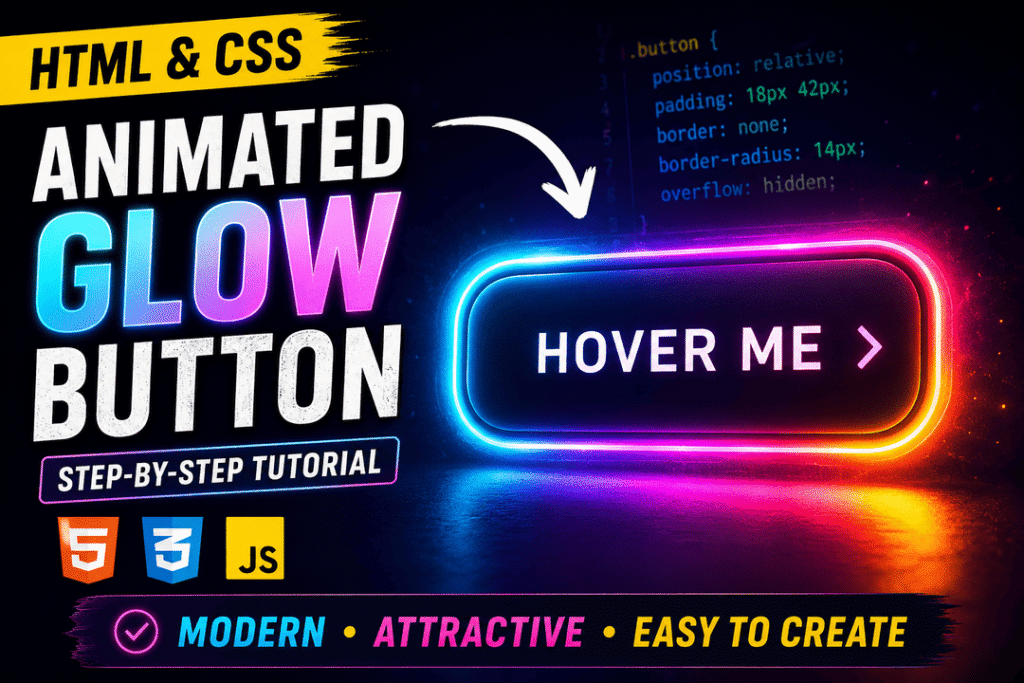
Learn how to create an animated neon glow button using HTML and CSS. Build a colorful moving gradient border, add smooth hover effects, and make the button accessible with keyboard focus and reduced-motion support.
Introduction
In this step-by-step tutorial, we’ll create an animated neon glow button using only HTML and CSS.
The button will feature a colorful moving gradient border, a dark inner surface, and a smooth hover animation.
We’ll build the effect using CSS pseudo-elements, keyframe animations, and transitions.
No JavaScript or external libraries are required.
What you’ll learn:
- How to create a button using semantic HTML.
- How to center elements with CSS Grid.
- How to use pseudo-elements to create a gradient border.
- How to animate gradients with CSS keyframes.
- How to add smooth hover effects.
- How to support keyboard focus and reduced-motion preferences.
Requirements: Basic HTML and CSS knowledge.
We’ll work in a single index.html file. Follow the steps in order, adding each CSS snippet to the existing <style> element. At the end, you’ll find the complete working source code.
Watch the Video Tutorial
Live Demo — Animated Neon Button
Hover over the button to see the animated neon border and glow effect. You can also use the Tab key to focus the button.
Step 1: Create the HTML Structure
Create a new file named index.html.
Add the following code:
<!doctype html>
<html lang="en">
<head>
  <meta charset="UTF-8">
  <meta name="viewport" content="width=device-width, initial-scale=1.0">
  <title>Animated Neon Button</title>

  <style>
    /* CSS goes here */
  </style>
</head>

<body>
  <button class="button" type="button">
    <span>Hover Me</span>
  </button>
</body>
</html>
Explanation
First, we create a simple HTML document containing one button.
We use the <button> element because it is a semantic, keyboard-accessible control.
Inside the button, we add a <span> element.
The span will allow us to keep the button text above the animated background layers that we’ll create later.
We also include a <style> element inside the document’s <head> so we can build the entire project in a single HTML file.
The button has type="button" to prevent accidental form submission if we later place it inside a form.
For now, the button is only a visual demonstration; it does not trigger an action when clicked.
Step 2: Center the Button and Create a Dark Background
Inside the <style> element, add:
* {
  box-sizing: border-box;
}

body {
  margin: 0;
  min-height: 100vh;
  display: grid;
  place-items: center;
  background: #070b18;
  font-family: Arial, sans-serif;
}
Explanation
Next, we center the button on the page.
We use CSS Grid with place-items: center, which is a simple way to center an element horizontally and vertically.
The min-height: 100vh property allows the body to fill at least the entire viewport height.
We also remove the default body margin.
The dark background color #070b18 provides contrast so our neon animation will be easy to see.
Finally, box-sizing: border-box makes it easier to control the dimensions of our elements.
Step 3: Style the Button
Add:
.button {
  position: relative;
  isolation: isolate;
  padding: 18px 42px;
  border: none;
  border-radius: 14px;
  background: #111827;
  color: #ffffff;
  font-size: 20px;
  letter-spacing: 1px;
  cursor: pointer;
  overflow: hidden;
}

.button span {
  position: relative;
  z-index: 2;
}
Explanation
Now we create the basic appearance of our button.
The background is dark, the text is white, and the corners are rounded.
The position: relative property is important because we’ll place absolutely positioned pseudo-elements inside the button.
The overflow: hidden property keeps the gradient animation within the button’s rounded shape.
We use isolation: isolate to create a predictable stacking context for our visual layers.
The span is positioned above the decorative layers using z-index: 2.
This ensures that the button text remains visible throughout the animation.
Step 4: Create the Animated Gradient Layer
Add:
.button::before {
  content: "";
  position: absolute;
  inset: 0;
  border-radius: inherit;

  background: linear-gradient(
    90deg,
    #00f5ff,
    #ff00ff,
    #ffe600,
    #00f5ff
  );

  background-size: 300% 100%;
  z-index: 0;

  animation: moveGlow 3s linear infinite;
}
Explanation
Now comes the main visual effect.
Using the ::before pseudo-element, we create a colorful gradient layer inside the button.
The gradient combines cyan, magenta, and yellow.
The background-size: 300% 100% property makes the gradient wider than the visible button.
This gives us enough gradient area to animate its position.
The pseudo-element sits inside the button and behind the text.
At this stage, the gradient may fill most of the button. In a later step, we’ll add a second pseudo-element that covers the center and leaves the colorful border visible.
Notice that we use z-index: 0 instead of a negative value. This prevents the gradient from disappearing behind the button’s own background.
Step 5: Animate the Gradient with Keyframes
Add:
@keyframes moveGlow {
  0% {
    background-position: 0% 50%;
  }

  100% {
    background-position: 100% 50%;
  }
}
Explanation
CSS keyframes define how an animation changes over time.
Here, we move the gradient horizontally from its starting position to its ending position.
Because we previously applied animation: moveGlow 3s linear infinite, the animation repeats continuously.
The 3s value controls the duration of each animation cycle.
The linear timing function maintains a constant animation speed.
The infinite keyword ensures that the movement keeps repeating.
This creates the colorful moving neon effect without using JavaScript.
Step 6: Create the Inner Dark Surface
Add:
.button::after {
  content: "";
  position: absolute;
  inset: 3px;
  background: #111827;
  border-radius: 11px;
  z-index: 1;
}
Explanation
The ::after pseudo-element creates the dark inner surface of the button.
We position it three pixels inside the button’s outer edges.
This leaves a thin visible ring of the animated gradient created by ::before.
The result looks like a colorful moving neon border rather than a fully gradient-filled button.
Our layers now have a clear order:
::before— animated gradient,z-index: 0.::after— inner dark surface,z-index: 1.<span>— button text,z-index: 2.
This stacking order ensures that all three elements remain visible in the correct positions.
Step 7: Add the Hover Effect
Add the following CSS after the existing button styles:
.button {
  box-shadow: 0 0 30px rgba(0, 255, 255, 0.15);

  transition:
    transform 0.3s ease,
    box-shadow 0.3s ease;
}

.button:hover {
  transform: translateY(-4px) scale(1.04);
  box-shadow: 0 0 45px rgba(0, 255, 255, 0.35);
}
Explanation
Finally, we add a hover interaction to make the button feel more dynamic.
The box-shadow property creates a soft glow around the button.
When the user hovers over it, the button moves slightly upward and becomes larger.
We use translateY(-4px) to move the button up by four pixels.
The scale(1.04) function increases its size by approximately four percent.
We also increase the glow intensity.
The transition property makes these changes smooth rather than instantaneous.
Combining the animated border with the hover effect creates a modern neon button.
Step 8: Add Keyboard Focus and Reduced-Motion Support
To make our demonstration more accessible, add:
.button:focus-visible {
  outline: 2px solid #00f5ff;
  outline-offset: 5px;
}

@media (prefers-reduced-motion: reduce) {
  .button,
  .button::before {
    animation: none;
    transition: none;
  }

  .button:hover {
    transform: none;
  }
}
Explanation
Hover effects are useful, but not everyone navigates with a mouse.
The :focus-visible selector gives keyboard users a clearly visible focus indicator when they reach the button using the Tab key.
We also use the prefers-reduced-motion media query to respect the user’s operating-system motion preferences.
When reduced motion is requested, the continuous gradient animation and transitions stop.
The colorful border remains visible, but it no longer moves.
This makes the effect more comfortable for users who prefer reduced animation.
Conclusion
We’ve now created an animated neon glow button using only HTML and CSS.
Along the way, we learned how to use pseudo-elements, gradient backgrounds, keyframe animations, stacking contexts, and smooth hover transitions.
We also added keyboard focus and reduced-motion support to make the component more accessible.
You can experiment with the gradient colors, animation speed, border thickness, and hover intensity to create your own version of the effect.
The same techniques can be used for animated cards, links, borders, and other interactive interface elements.
Complete Source Code
Below is the complete working example.
Copy it into a file named index.html and open it in your browser.
<!doctype html>
<html lang="en">
<head>
  <meta charset="UTF-8">
  <meta name="viewport" content="width=device-width, initial-scale=1.0">
  <title>Animated Neon Button</title>

  <style>
    * {
      box-sizing: border-box;
    }

    body {
      margin: 0;
      min-height: 100vh;
      display: grid;
      place-items: center;
      background: #070b18;
      font-family: Arial, sans-serif;
    }

    .button {
      position: relative;
      isolation: isolate;
      padding: 18px 42px;
      border: none;
      border-radius: 14px;
      background: #111827;
      color: #ffffff;
      font-size: 20px;
      letter-spacing: 1px;
      cursor: pointer;
      overflow: hidden;

      box-shadow: 0 0 30px rgba(0, 255, 255, 0.15);

      transition:
        transform 0.3s ease,
        box-shadow 0.3s ease;
    }

    .button span {
      position: relative;
      z-index: 2;
    }

    .button::before {
      content: "";
      position: absolute;
      inset: 0;
      border-radius: inherit;

      background: linear-gradient(
        90deg,
        #00f5ff,
        #ff00ff,
        #ffe600,
        #00f5ff
      );

      background-size: 300% 100%;
      z-index: 0;
      animation: moveGlow 3s linear infinite;
    }

    @keyframes moveGlow {
      0% {
        background-position: 0% 50%;
      }

      100% {
        background-position: 100% 50%;
      }
    }

    .button::after {
      content: "";
      position: absolute;
      inset: 3px;
      background: #111827;
      border-radius: 11px;
      z-index: 1;
    }

    .button:hover {
      transform: translateY(-4px) scale(1.04);
      box-shadow: 0 0 45px rgba(0, 255, 255, 0.35);
    }

    .button:focus-visible {
      outline: 2px solid #00f5ff;
      outline-offset: 5px;
    }

    @media (prefers-reduced-motion: reduce) {
      .button,
      .button::before {
        animation: none;
        transition: none;
      }

      .button:hover {
        transform: none;
      }
    }
  </style>
</head>

<body>
  <button class="button" type="button">
    <span>Hover Me</span>
  </button>
</body>
</html>