Mouse Glow Effect: Build an Interactive Glassmorphism Hero with HTML, CSS & JavaScript
Introduction
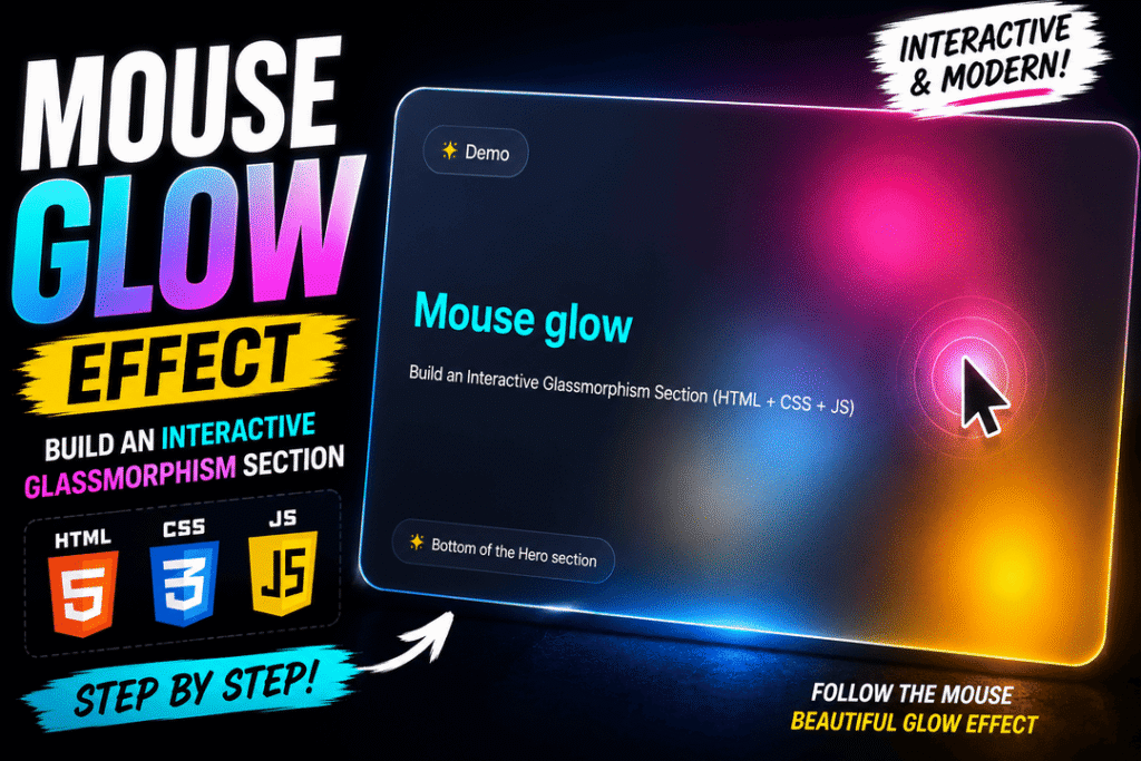
Create a modern glassmorphism hero section with a colorful glow that follows your mouse cursor. In this step-by-step tutorial, we’ll build the component using HTML, CSS gradients, and a small amount of vanilla JavaScript.
What you’ll learn:
- How to structure a hero component with HTML.
- How to create a glassmorphism effect with CSS.
- How to build soft glowing backgrounds using radial gradients.
- How to track mouse coordinates with JavaScript.
- How to connect JavaScript and CSS custom properties to create interactive effects.
Requirements: Basic HTML, CSS, and JavaScript knowledge. No libraries or frameworks are required.
We’ll use a single file named index.html. Follow each step in order, adding the CSS to the existing <style> element and the JavaScript to the existing <script> element. At the end, you’ll find the complete working code.
Watch the Video Tutorial
Live Demo — Mouse Glow Effect
Move your mouse over the panel to see the interactive glow.
Step 1: Create the Basic HTML Document
Start by creating a new file called index.html and add the following structure:
<!doctype html>
<html lang="en">
<head>
  <meta charset="utf-8">
  <meta name="viewport" content="width=device-width, initial-scale=1">
  <title>Mouse Glow</title>

  <style>
    /* CSS goes here */
  </style>
</head>
<body>

  <!-- Hero section goes here -->

  <script>
    // JavaScript goes here
  </script>
</body>
</html>
Explanation
This is the basic structure of our web page.
The <head> contains our page settings and a <style> element where we’ll write all the CSS.
Inside the <body>, we’ll place the hero section that contains our glass panel and glowing background.
At the bottom of the page, we’ll use a <script> element to control the glow with JavaScript.
Placing the script after the HTML ensures that our elements exist before JavaScript tries to access them.
Step 2: Build the Hero Section HTML
Inside the <body>, above the script, add:
<div class="wrap" id="wrap">
  <div class="glow" aria-hidden="true"></div>

  <div class="card">
    <div class="content">
      <div class="pill">✨ Demo</div>

      <div>
        <h1>Mouse glow</h1>
        <p>
          Build an Interactive Glassmorphism Section
          (HTML + CSS + JS)
        </p>
      </div>

      <div class="pill">
        ✨ Bottom of the Hero section
      </div>
    </div>
  </div>
</div>
Explanation
We start by creating the structure of our hero section.
The .wrap element is the outer container. It controls the dimensions of the component and contains all the visual layers.
The .glow element will produce the colorful lighting effect. We place it before .card so that it appears behind the glass panel. Because it is purely decorative, we add aria-hidden="true".
The .card element will become our glassmorphism panel.
Inside it, .content organizes the heading, paragraph, and two small badges.
We also add id="wrap" to the outer container. Later, JavaScript will use this ID to detect mouse movement within the component.
Step 3: Define Colors and Style the Page Background
Add the following CSS inside <style>:
:root {
  --bg0: #060814;
  --bg1: #0a1230;
  --text: #d9e9ff;
}

* {
  box-sizing: border-box;
}

html,
body {
  min-height: 100%;
}

body {
  min-height: 100vh;
  margin: 0;
  padding: 24px 0;
  display: grid;
  place-items: center;

  background:
    radial-gradient(
      1200px 700px at 20% 20%,
      rgba(80, 140, 255, .22),
      transparent 60%
    ),
    radial-gradient(
      900px 600px at 85% 30%,
      rgba(255, 120, 220, .18),
      transparent 60%
    ),
    linear-gradient(
      140deg,
      var(--bg0),
      var(--bg1)
    );

  font-family: system-ui, -apple-system,
    "Segoe UI", Roboto, Arial, sans-serif;

  color: var(--text);
  overflow-x: hidden;
}
Explanation
Before creating the visual effects, we need to position our component and define the page colors.
The :root selector contains CSS custom properties for our background and text colors. Using variables makes it easier to change or reuse these values later.
We use CSS Grid with place-items: center to center the hero section horizontally and vertically.
Instead of using a single background color, we combine two radial gradients with one linear gradient.
The radial gradients add soft blue and pink lighting, while the linear gradient creates a dark background.
This contrast will make the glass panel and mouse glow much more noticeable.
We also allow vertical scrolling when necessary, rather than clipping content on smaller screens.
Step 4: Style the Outer Wrapper
Add:
.wrap {
  width: min(980px, 92vw);
  aspect-ratio: 16 / 9;
  min-height: 280px;
  border-radius: 28px;
  position: relative;
  overflow: hidden;
}
Explanation
The wrapper controls the overall size and shape of our component.
The min() function limits the width to 980 pixels while allowing the component to shrink with the viewport.
The aspect-ratio property gives the hero a cinematic 16:9 shape on larger screens.
We add a minimum height to prevent the content from becoming too compressed on narrow mobile screens.
The position: relative property creates a positioning reference for the absolutely positioned elements inside the wrapper.
Finally, overflow: hidden ensures that the glowing layers stay within the rounded corners.
Step 5: Create the Initial Glow Layer
First, extend the existing :root rule with these three variables:
:root {
  --glowA: rgba(90, 210, 255, .38);
  --glowB: rgba(255, 120, 220, .30);
  --glowC: rgba(255, 210, 110, .22);
}
Then add:
.glow {
  position: absolute;
  inset: 0;

  background:
    radial-gradient(
      340px 340px at 50% 50%,
      var(--glowA),
      transparent 60%
    ),
    radial-gradient(
      280px 280px at calc(50% + 120px) calc(50% - 90px),
      var(--glowB),
      transparent 65%
    ),
    radial-gradient(
      240px 240px at calc(50% - 140px) calc(50% + 110px),
      var(--glowC),
      transparent 65%
    );

  filter: blur(18px) saturate(1.2);
  opacity: .9;
  pointer-events: none;
}
Explanation
Now we create the colorful light sources using CSS radial gradients.
Each gradient has a different size, color, and position.
The first gradient creates a soft blue glow near the center. The second adds a pink glow, while the third introduces warm yellow lighting.
The blur() filter removes hard edges and makes the colors blend together naturally.
The saturate() function slightly increases the color intensity.
We also set pointer-events: none so this decorative layer cannot interfere with mouse interaction.
For now, the gradients have fixed positions. Later, we’ll replace those positions with values controlled by JavaScript.
Step 6: Create the Glassmorphism Panel
Add:
.card {
  position: absolute;
  inset: 0;
  border-radius: 28px;

  background: var(--glass);
  border: 1px solid var(--border);

  backdrop-filter: blur(10px);
  box-shadow: 0 30px 120px rgba(0, 0, 0, .45);
}
Also extend :root with:
:root {
  --glass: rgba(255, 255, 255, .06);
  --border: rgba(255, 255, 255, .10);
}
Explanation
This is where the glassmorphism effect appears.
The semi-transparent background allows the colors underneath the card to remain visible.
The backdrop-filter: blur(10px) property blurs the background behind the panel, creating a frosted-glass appearance.
We also add a subtle border and a large shadow.
Together, these properties make the panel appear slightly elevated above the background.
The glass effect works especially well with the colorful glow layer we created in the previous step.
Step 7: Arrange the Content with Flexbox
Add:
.content {
  position: absolute;
  inset: 0;
  padding: 32px;

  display: flex;
  flex-direction: column;
  justify-content: space-between;
}
Explanation
The content area fills the entire glass panel.
We use Flexbox with flex-direction: column to arrange the content vertically.
The justify-content: space-between property distributes the three main content groups: the top badge, the heading and description, and the bottom badge.
This creates a balanced layout without manually positioning each element.
Step 8: Style the Heading, Paragraph, and Badges
Add:
h1 {
  margin: 0 0 12px;
  color: aqua;
  font-size: clamp(28px, 4vw, 40px);
  line-height: 1.1;
}

p {
  margin: 0;
  color: white;
  font-size: clamp(14px, 1.8vw, 20px);
  line-height: 1.45;
}

.pill {
  display: inline-flex;
  width: fit-content;
  padding: 8px 12px;

  border-radius: 999px;
  border: 1px solid rgba(255, 255, 255, .12);
  background: rgba(255, 255, 255, .06);

  font-size: 12px;
  opacity: .92;
}

@media (max-width: 600px) {
  .content {
    padding: 20px;
  }
}
Explanation
The heading uses a bright aqua color that contrasts with the dark background.
The clamp() function allows the text size to adapt to different screen sizes while staying within reasonable limits.
For the badges, we use display: inline-flex and width: fit-content to keep them only as wide as their content.
A large border-radius creates their pill-shaped appearance.
The transparent background and subtle border maintain the same visual style as the glass panel.
Finally, a small media query reduces the content padding on mobile devices.
At this point, the hero section has its complete static appearance.
Next, we’ll make the glow interactive.
Step 9: Select the Wrapper with JavaScript
Inside the existing <script> element, add:
const wrap = document.getElementById('wrap');Explanation
Before we can react to mouse movement, we need a reference to the wrapper element.
The document.getElementById() method finds the element with the specified ID.
The browser returns the corresponding DOM element, which we store in the wrap variable.
We can now attach events and modify CSS properties on this element.
Step 10: Detect Mouse Movement and Calculate Coordinates
Continue the same script:
const wrap = document.getElementById('wrap');

wrap.addEventListener('mousemove', (e) => {
  const r = wrap.getBoundingClientRect();

  const x = (e.clientX - r.left) / r.width;
  const y = (e.clientY - r.top) / r.height;
});
This replaces the previous one-line JavaScript snippet.
Explanation
The mousemove event fires whenever the mouse cursor moves inside the wrapper.
The getBoundingClientRect() method returns the size and position of the element relative to the viewport.
The clientX and clientY values provide the cursor position relative to that same viewport.
By subtracting the element’s left and top positions, we calculate the cursor position inside the wrapper.
We then divide by the wrapper’s width and height to normalize those values.
The result is a range between 0 and 1:
0— left or top edge.0.5— center.1— right or bottom edge.
Normalized coordinates make our interaction work with different component sizes.
Step 11: Update CSS Variables with JavaScript
Inside the mousemove event listener, immediately after calculating x and y, add:
wrap.style.setProperty(
  '--mx',
  `${(x * 100).toFixed(2)}%`
);

wrap.style.setProperty(
  '--my',
  `${(y * 100).toFixed(2)}%`
);
Explanation
JavaScript can modify CSS custom properties directly.
The style.setProperty() method updates the value of a CSS variable on a selected element.
We convert the normalized coordinates into percentages by multiplying them by 100.
The toFixed(2) method keeps the percentage values to two decimal places.
The variables now represent the current mouse position:
--mx— horizontal position.--my— vertical position.
As the cursor moves, JavaScript continuously updates these values.
Since CSS custom properties are inherited, the nested .glow element can read the values from .wrap.
Step 12: Make the Glow Follow the Mouse
Now return to the .glow CSS rule.
Replace its original background declaration with:
.glow {
  background:
    radial-gradient(
      340px 340px
      at var(--mx, 50%) var(--my, 50%),
      var(--glowA),
      transparent 60%
    ),
    radial-gradient(
      280px 280px
      at calc(var(--mx, 50%) + 120px)
         calc(var(--my, 50%) - 90px),
      var(--glowB),
      transparent 65%
    ),
    radial-gradient(
      240px 240px
      at calc(var(--mx, 50%) - 140px)
         calc(var(--my, 50%) + 110px),
      var(--glowC),
      transparent 65%
    );
}
Keep the other .glow properties from Step 5 unchanged.
Explanation
The gradient positions are no longer fixed.
Instead, they read the values stored in --mx and --my.
The var() function allows us to use JavaScript-controlled CSS variables directly inside the gradients.
The second and third gradients use calc() to create small offsets from the main glow position.
This gives the effect more depth by allowing several colored light sources to move together.
The fallback value of 50% keeps the glow centered before the user moves the mouse. It also provides a useful static appearance on touch devices.
Because JavaScript updates the variables continuously, the light appears to follow the cursor.
We now have a fully working interactive mouse-glow effect using HTML, CSS, and vanilla JavaScript.
Conclusion
In this tutorial, we built an interactive glassmorphism hero section using standard web technologies.
We combined HTML structure, CSS radial gradients, translucent backgrounds, and JavaScript mouse tracking to create a glowing effect that responds to cursor movement.
The key idea is connecting mouse coordinates to CSS custom properties.
Once you understand this technique, you can apply it to interactive cards, hero backgrounds, hover effects, and other modern web interfaces.
Experiment with the glow colors, gradient sizes, blur intensity, and offsets to create your own version of the effect.
Complete Source Code
Below is the complete working example.
You can copy it into a single index.html file and open it in your browser.
<!doctype html>
<html lang="en">
<head>
  <meta charset="utf-8">
  <meta name="viewport" content="width=device-width, initial-scale=1">
  <title>Mouse Glow</title>

  <style>
    :root {
      --bg0: #060814;
      --bg1: #0a1230;
      --text: #d9e9ff;

      --glass: rgba(255, 255, 255, .06);
      --border: rgba(255, 255, 255, .10);

      --glowA: rgba(90, 210, 255, .38);
      --glowB: rgba(255, 120, 220, .30);
      --glowC: rgba(255, 210, 110, .22);
    }

    * {
      box-sizing: border-box;
    }

    html,
    body {
      min-height: 100%;
    }

    body {
      min-height: 100vh;
      margin: 0;
      padding: 24px 0;
      display: grid;
      place-items: center;

      background:
        radial-gradient(
          1200px 700px at 20% 20%,
          rgba(80, 140, 255, .22),
          transparent 60%
        ),
        radial-gradient(
          900px 600px at 85% 30%,
          rgba(255, 120, 220, .18),
          transparent 60%
        ),
        linear-gradient(
          140deg,
          var(--bg0),
          var(--bg1)
        );

      font-family: system-ui, -apple-system,
        "Segoe UI", Roboto, Arial, sans-serif;

      color: var(--text);
      overflow-x: hidden;
    }

    .wrap {
      width: min(980px, 92vw);
      aspect-ratio: 16 / 9;
      min-height: 280px;
      border-radius: 28px;
      position: relative;
      overflow: hidden;
    }

    .glow {
      position: absolute;
      inset: 0;

      background:
        radial-gradient(
          340px 340px
          at var(--mx, 50%) var(--my, 50%),
          var(--glowA),
          transparent 60%
        ),
        radial-gradient(
          280px 280px
          at calc(var(--mx, 50%) + 120px)
             calc(var(--my, 50%) - 90px),
          var(--glowB),
          transparent 65%
        ),
        radial-gradient(
          240px 240px
          at calc(var(--mx, 50%) - 140px)
             calc(var(--my, 50%) + 110px),
          var(--glowC),
          transparent 65%
        );

      filter: blur(18px) saturate(1.2);
      opacity: .9;
      pointer-events: none;
    }

    .card {
      position: absolute;
      inset: 0;
      border-radius: 28px;

      background: var(--glass);
      border: 1px solid var(--border);

      backdrop-filter: blur(10px);
      box-shadow: 0 30px 120px rgba(0, 0, 0, .45);
    }

    .content {
      position: absolute;
      inset: 0;
      padding: 32px;

      display: flex;
      flex-direction: column;
      justify-content: space-between;
    }

    h1 {
      margin: 0 0 12px;
      color: aqua;
      font-size: clamp(28px, 4vw, 40px);
      line-height: 1.1;
    }

    p {
      margin: 0;
      color: white;
      font-size: clamp(14px, 1.8vw, 20px);
      line-height: 1.45;
    }

    .pill {
      display: inline-flex;
      width: fit-content;
      padding: 8px 12px;

      border-radius: 999px;
      border: 1px solid rgba(255, 255, 255, .12);
      background: rgba(255, 255, 255, .06);

      font-size: 12px;
      opacity: .92;
    }

    @media (max-width: 600px) {
      .content {
        padding: 20px;
      }
    }
  </style>
</head>

<body>
  <div class="wrap" id="wrap">
    <div class="glow" aria-hidden="true"></div>

    <div class="card">
      <div class="content">
        <div class="pill">✨ Demo</div>

        <div>
          <h1>Mouse glow</h1>
          <p>
            Build an Interactive Glassmorphism Section
            (HTML + CSS + JS)
          </p>
        </div>

        <div class="pill">
          ✨ Bottom of the Hero section
        </div>
      </div>
    </div>
  </div>

  <script>
    const wrap = document.getElementById('wrap');

    wrap.addEventListener('mousemove', (e) => {
      const r = wrap.getBoundingClientRect();

      const x = (e.clientX - r.left) / r.width;
      const y = (e.clientY - r.top) / r.height;

      wrap.style.setProperty(
        '--mx',
        `${(x * 100).toFixed(2)}%`
      );

      wrap.style.setProperty(
        '--my',
        `${(y * 100).toFixed(2)}%`
      );
    });
  </script>
</body>
</html>